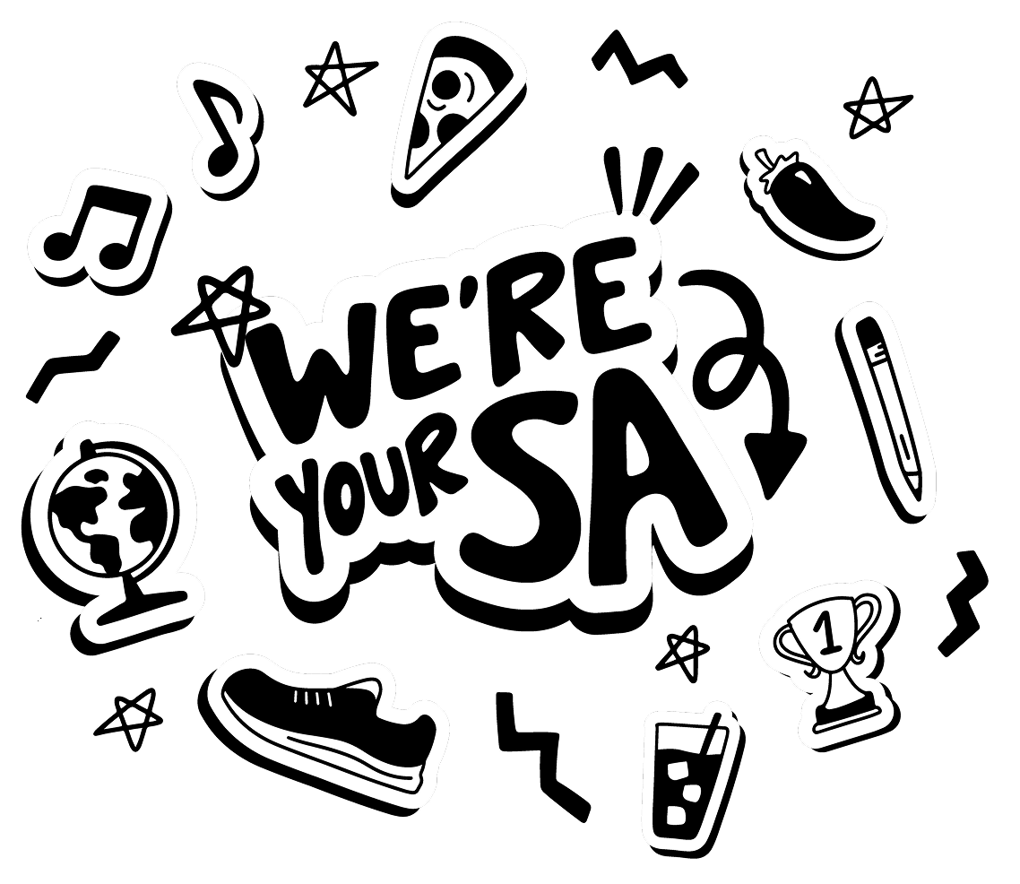
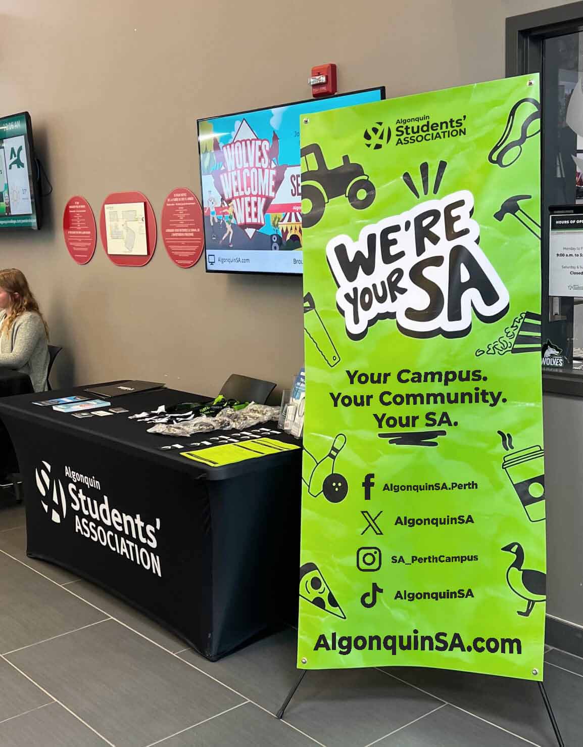
We’re Your SA — Energizing the Algonquin Students’ Association
Branding
Procreate
Illustrator
The Rundown
The Algonquin Students’ Association (SA) is a not-for-profit corporation that represents and works for Algonquin College students. With a mission to create an environment that inspires a passion for student success, the SA works tirelessly to better the lives of their students. This secondary brand for the SA brought new life into their corporate identity, infusing the brand with what the SA is all about.
Motivations
With lines blurring between the colleges corporate identity and the Students’ Associations, students struggled with distinguishing what services the SA provide vs the college.
Goals
- Increase awareness of Student Association services and supports for students
- Better distinguish themselves from the college
- Create a more approachable brand to better connect with the student body
Responsibilities
I worked on this project during my time at the Algonquin Students’ Association in their Marketing and Brand Management department. As the Lead Designer, I worked alongside Summar Bourada, Elyse Fowler, Kate Ardidon and Ian Skoczylas to bring this secondary brand to life.
Skills
- Concept Development
- Visual Identity
- Branding
- Print & Digital Assets
- Merchandise
Software
- Adobe Illustrator
- Procreate
Research
Student feedback provided a great deal of motivation for this brand development. After looking at the student input, the marketing team found most feedback identified two main pain points:
Confusing Corporate Identity
Although the SA provides a great deal of services, and throws the majority of large on-campus events, students still struggled with identifying what was being done by the college vs the SA.
Service Awareness
Layered on top of the confusion between the two entities, students weren’t aware of the variety of services offered to them by the SA in the first place.
Ideation
Conceptualizing the Identity
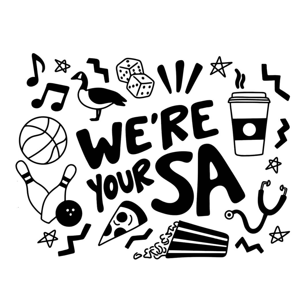
After meeting with my marketing team to discuss the initial creative request and mood board, it was time to put ideas to paper. With the objective of pulling away from a colder corporate identity, I aimed to bring a human touch to the secondary brand. Sketching everything out with a squeaky, almost dead marker forced me to design without the ability to erase, creating a system that let ideation flow without edits.

Development
Building out the Brand
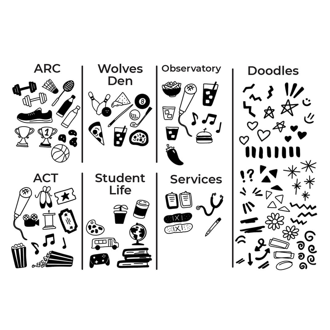
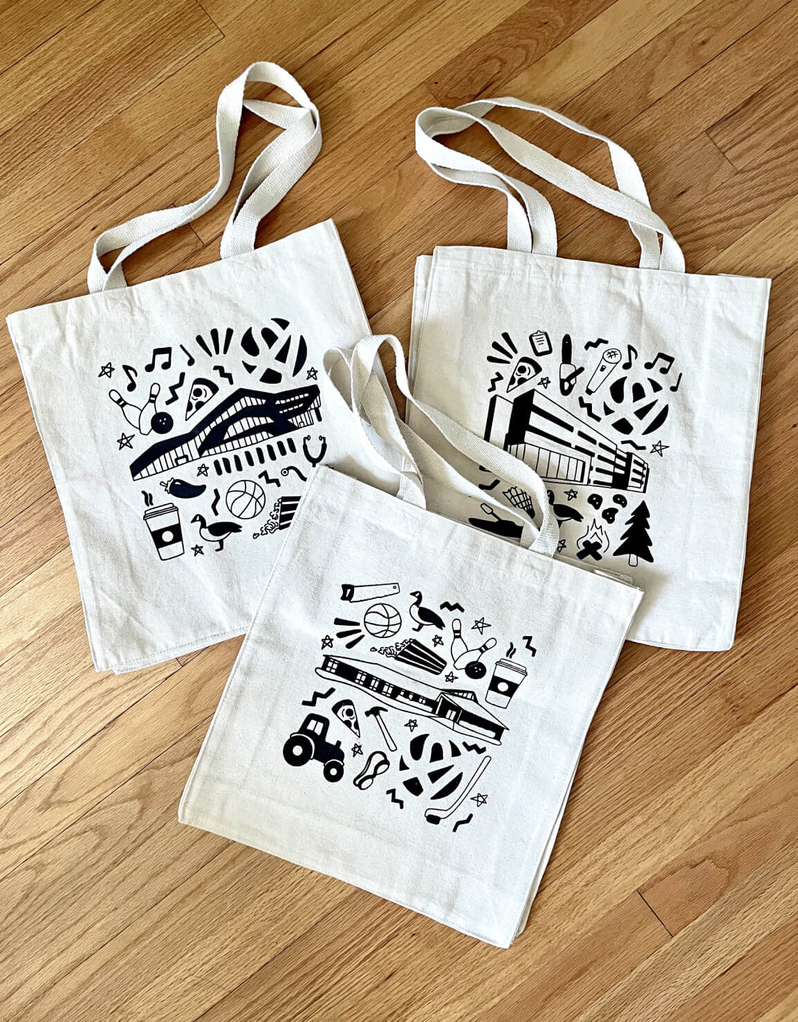
After many and many pages of marker sketches, it was time to move to a digital space. Every hand drawn illustration was traced over in Procreate to ensure it did not lose it’s hand drawn nature, and then was vectorized in Illustrator. Aligning with the mission to better highlight our services across campus, each department or location of significance had their own unique set of icons to show off what they do.
Refinement
Looking at all the Details
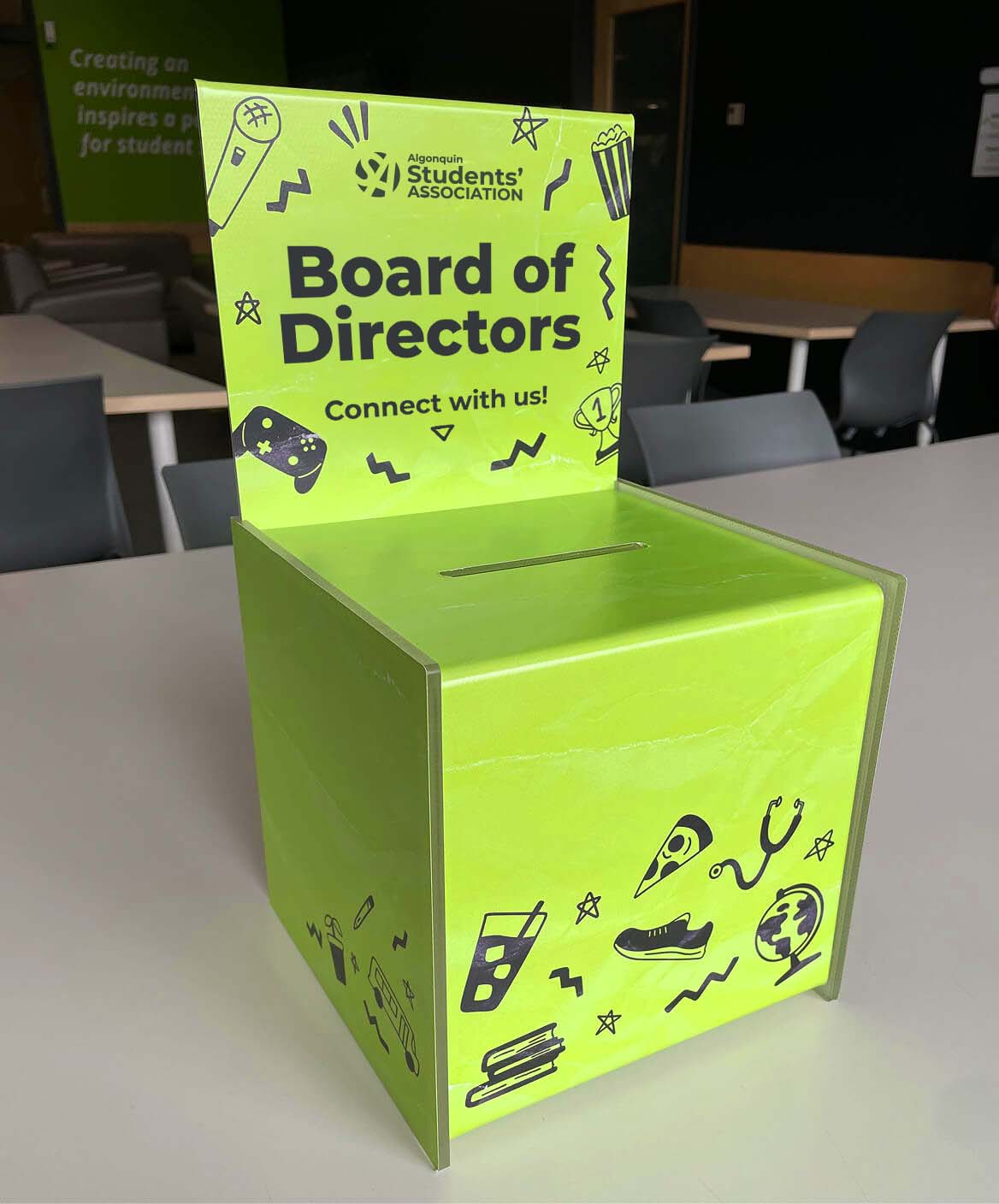
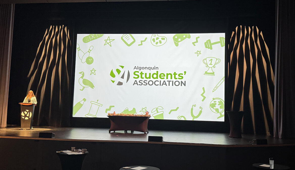
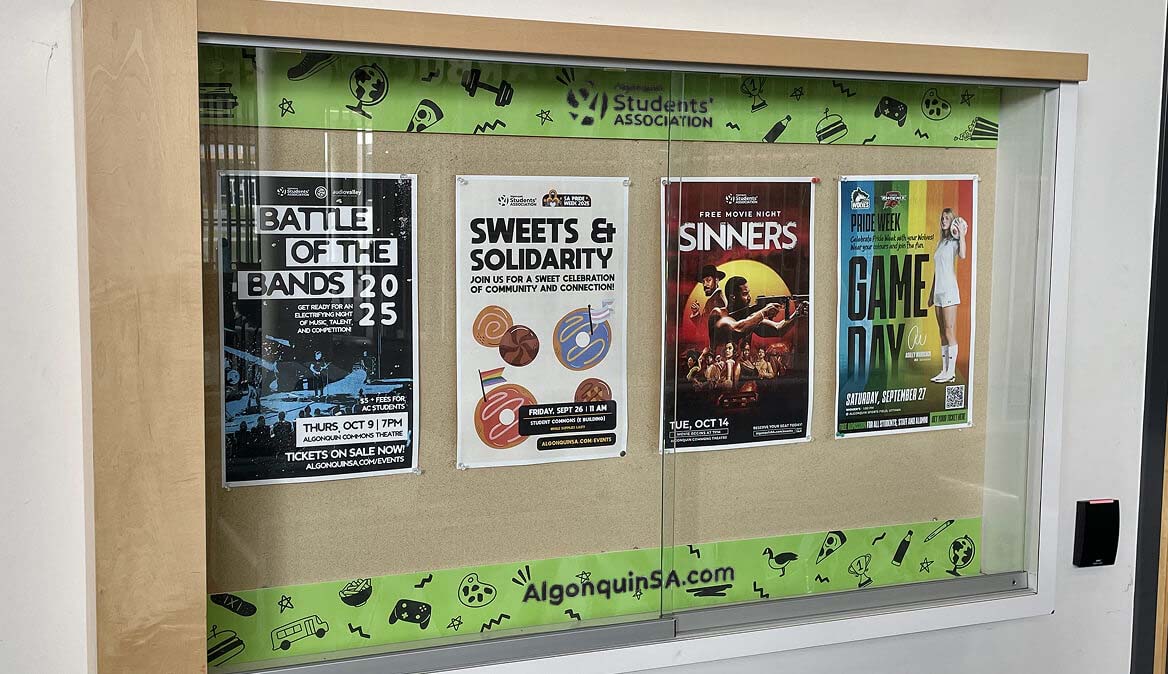
This brand became one with many elements. In order to ensure it could be used practically, and on a large scale, guidelines were developed to help keep the brand consistent. Understanding how the logo, icons, and doodles all worked in harmony with each other allowed the brand to become stronger.
Execution
Finalizing the Brand
After many meeting and pitches of directions for how colour and imagery could be pulled into this brand, it was paired down to our core branding colours, allowing our green, black, and white to be the branding bridge between our corporate identity and our new secondary brand.

Final Brand
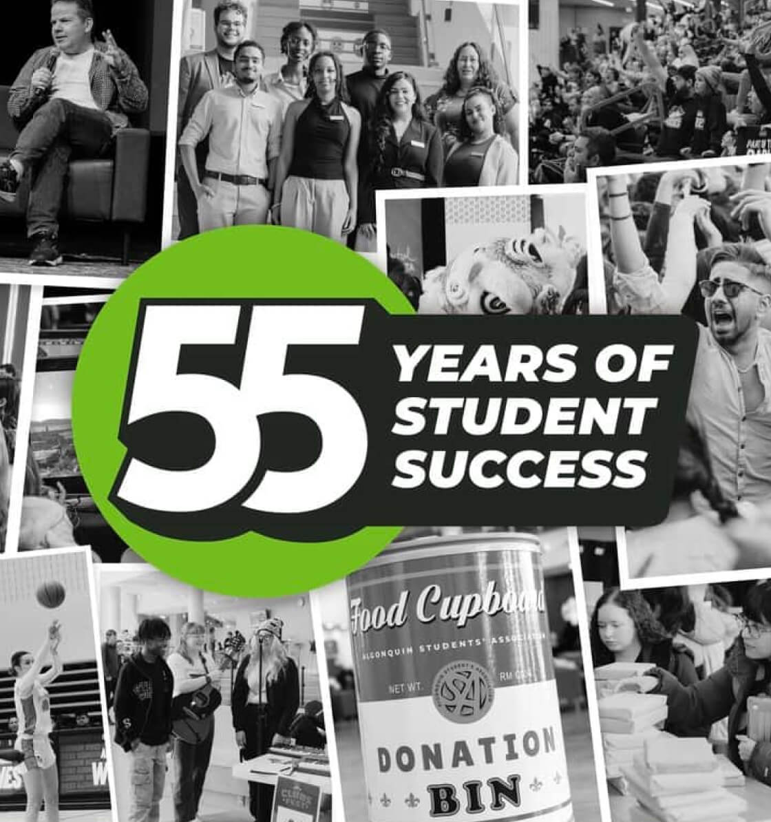
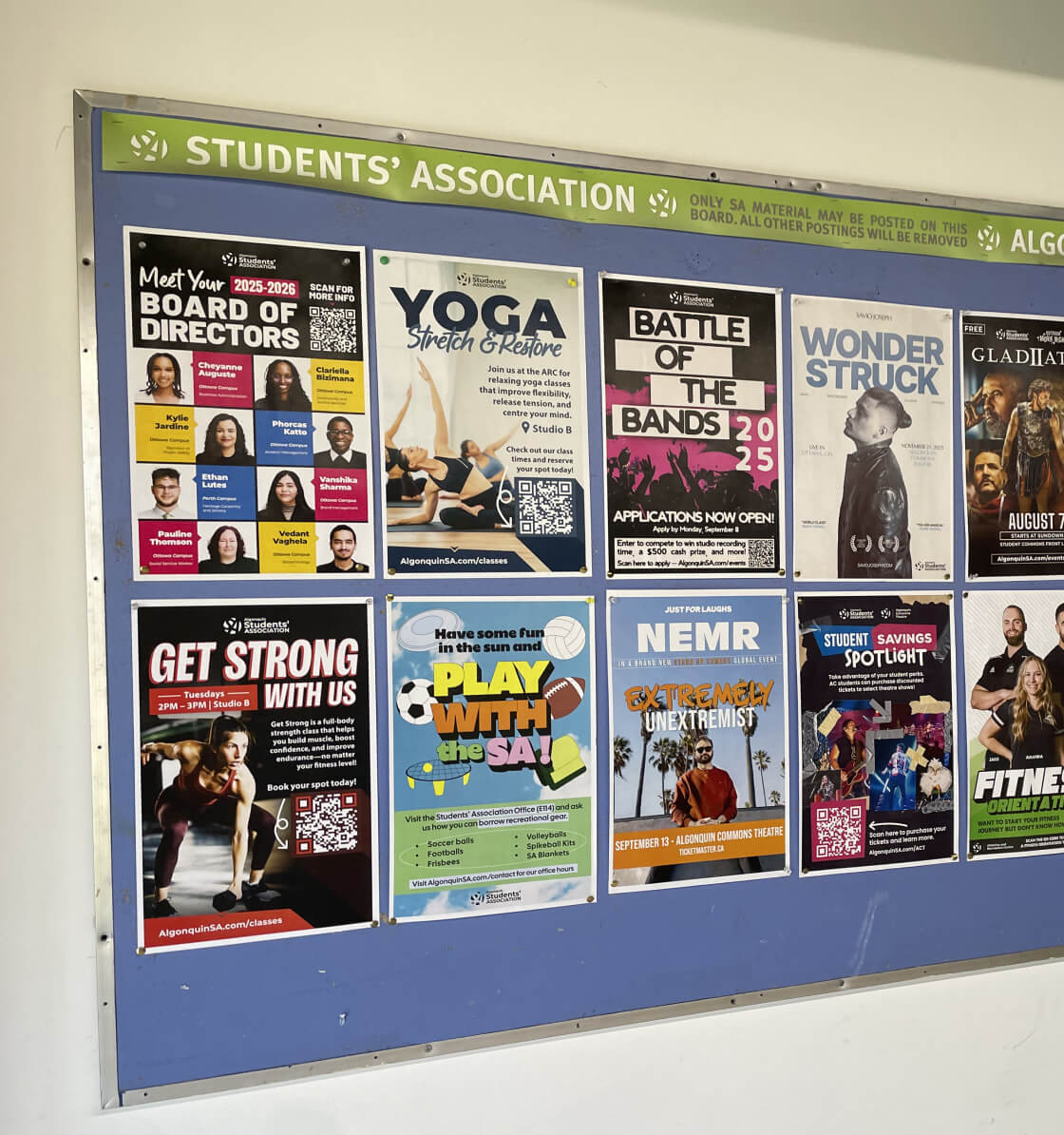
Over the past year, this brand has become a staple in the Algonquin Students’ Association identity, being used throughout campus and across mediums. From internal presentations, to student facing campaigns, the SA has become a more distinct and welcoming support for students to connect with.
Interested in Collaborating?
I’m excited to hear about all your great ideas and how we can work together to make something memorable. All you have to do is reach out!